4.2.13 Event Trend
Overview
The Event Trend panel overlays time-series metrics with highlighted event intervals. It connects data signals to the events that occurred during them, making it immediately visible how measured values behaved before, during, and after each event.
You can add any combination of element attributes, events, and analyses to the panel. When you add an event, the attributes associated with that event's trigger conditions are automatically included, and the event's active duration is highlighted on the time axis. When you add an analysis, all attributes referenced by the analysis are added, along with any events the analysis has generated.
When to Use
Use the Event Trend panel when:
- You need to correlate process variables with event occurrences — for example, to see how temperature or pressure behaved during an alarm window
- You want to investigate the root cause of an event by examining the associated metrics in the period leading up to, during, and after the event
- You need to compare multiple occurrences of the same event type side by side on a normalized time axis
- You are building an investigation view that combines metric trends and event context on a single panel
For plain time-series analysis without event overlay, use the Trend Chart. For correlating two process variables against each other rather than against time, use the Scatter Chart.
Configuration
Data Sources
Click Add to include data in the Event Trend panel. Three source types are supported:
| Source Type | Effect |
|---|---|
| Attribute | Adds a time-series line for the selected element attribute |
| Event | Adds all attributes associated with the event's trigger conditions and highlights the event's active time range on the chart |
| Analysis | Adds all attributes referenced by the analysis and overlays all events generated by the analysis |
Analysis Tools
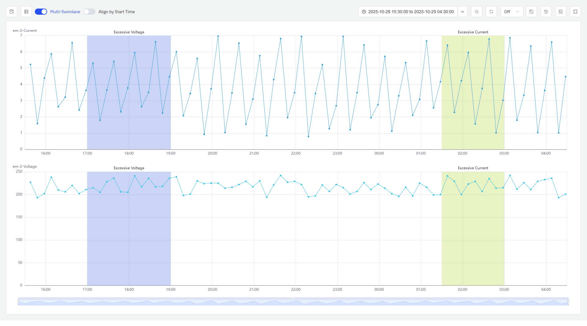
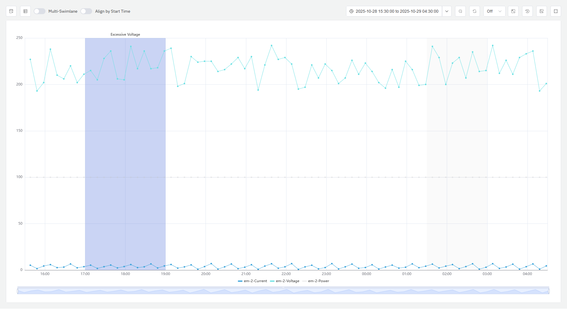
Multi-Swimlane
Multi-swimlane mode is enabled by default. In this mode each metric occupies its own horizontal band, keeping signals with different scales visually separated and readable.
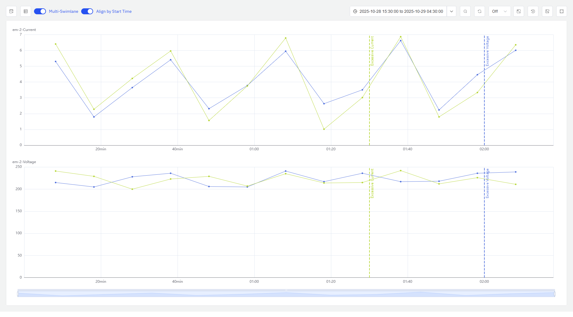
Align by Start Time
When disabled (default), each event interval is shown at its actual calendar time. When enabled, all event occurrences are shifted to a common start point and overlaid on the same time axis — allowing you to compare how the associated metrics evolved across multiple event occurrences.
Highlight Event Metrics
When you hover over an event interval on the chart, the attributes associated with that event's trigger conditions are highlighted. All other metrics and event intervals are dimmed, making it easy to focus on the relevant signals for a specific event occurrence.
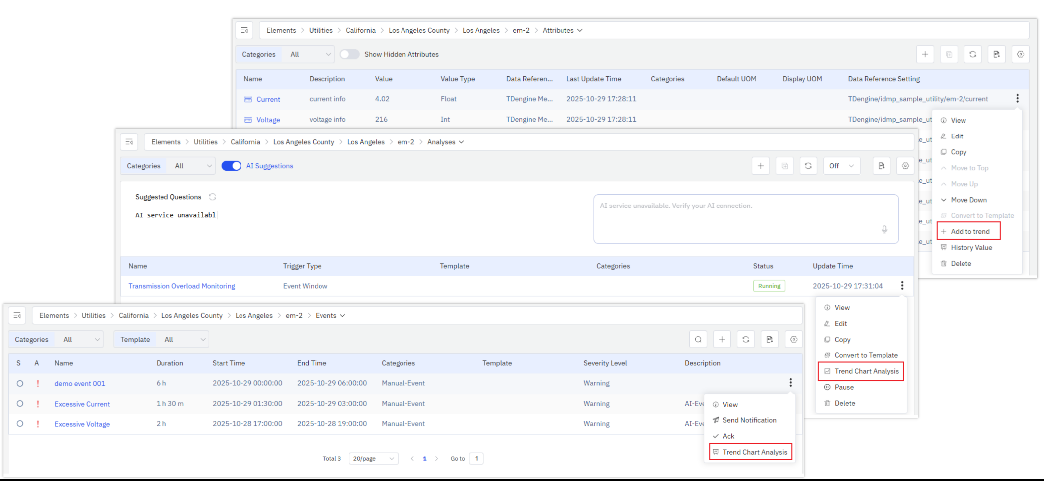
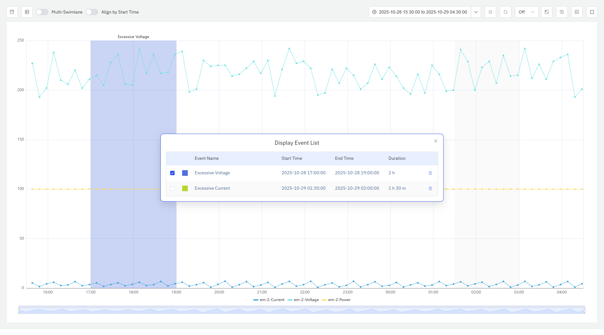
Event List
Click the Event List button in the upper-left corner to open the event list panel. The panel shows event name, start time, end time, and duration for all events currently displayed in the chart. The panel can be freely dragged.
Events in the list are checked by default. Checked events are highlighted on the chart; unchecked events are dimmed. Events can also be removed from the list.
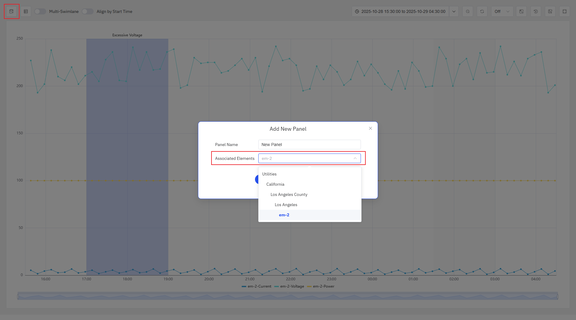
Saving as a Panel
Click Save in the upper-left corner to permanently save the current analysis view as a panel. In the save dialog, select the element under which to save the panel. The available options include the elements whose data is already in the current view, plus their ancestor nodes in the asset tree.
Example Scenarios
Alarm root cause investigation. A maintenance engineer adds temperature and vibration attributes for a motor, then adds the motor's overtemperature alarm event. The Event Trend panel highlights the 90-minute alarm window and shows the full temperature rise in the hours leading up to it, alongside the vibration signal. The correlation makes the cause immediately apparent.
Batch comparison. A quality engineer enables Align by Start Time across 30 batch events for a reactor. The overlaid view reveals that a subset of batches — those producing below-spec product — share a distinctive pressure drop at approximately 45 minutes into the cycle. All other batches follow the expected profile. The finding is saved as a panel on the reactor's panel list for ongoing monitoring.
Analysis-driven investigation. A process engineer adds an anomaly detection analysis to the panel. All attributes the analysis monitors are automatically included, and each anomaly event the analysis has flagged is highlighted. The engineer can scroll through event occurrences using the Event List, dimming all but the relevant signals for each one, to build a picture of which conditions most reliably predict the anomaly.
