4.2.14 Map Chart
Overview
The Map Chart displays geographic data as a choropleth map — regions filled with colors proportional to their associated metric values. It is used for spatial analysis when data is organized by geographic area: countries, provinces, cities, districts, or custom regions defined by a GeoJSON file.
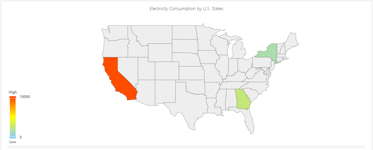
The color intensity of each region reflects the metric value — darker or more saturated regions indicate higher values. A color scale legend shows the mapping from color to value.
When to Use
Use the Map Chart when:
- Your elements are organized by geographic area and you want to visualize a metric across those areas
- You need to answer questions like "which region has the highest energy consumption?" or "which sites are underperforming?"
- You have a custom geographic boundary definition (GeoJSON) matching your operational territories
For time-series trend analysis, use the Trend Chart. For non-geographic comparisons across categories, use the Bar Chart.
Configuration
Edit Mode Toolbar
In addition to the common edit mode controls, the Map Chart adds:
| Control | Description |
|---|---|
| Save as Image | Download the current preview as a PNG image |
| Full Screen | Expand the editor preview to fill the browser window |
| Panel Insights | Run AI analysis on the current preview data |
Graph Settings
Map GeoJSON
The map requires a GeoJSON file that defines the geographic region boundaries. Upload your GeoJSON file using the Map GeoJSON setting:
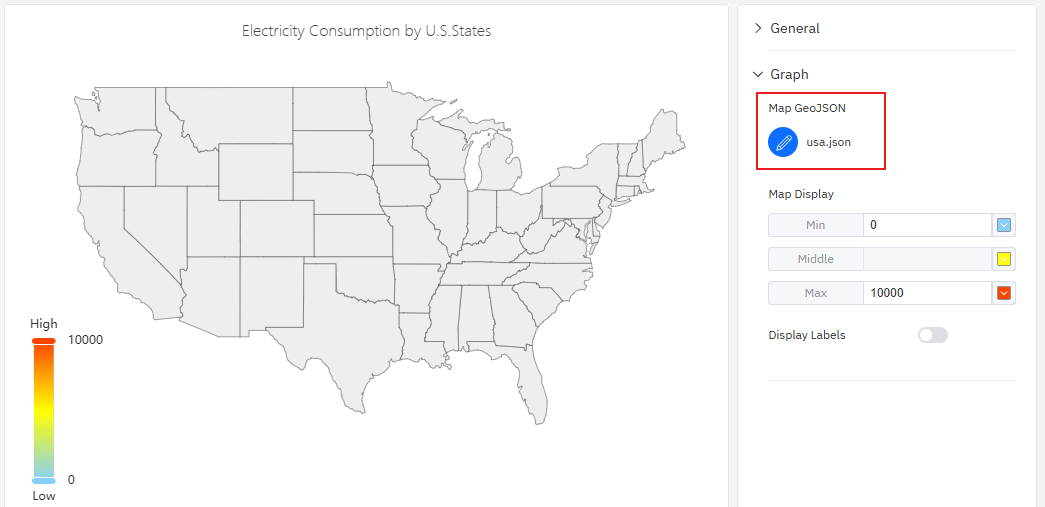
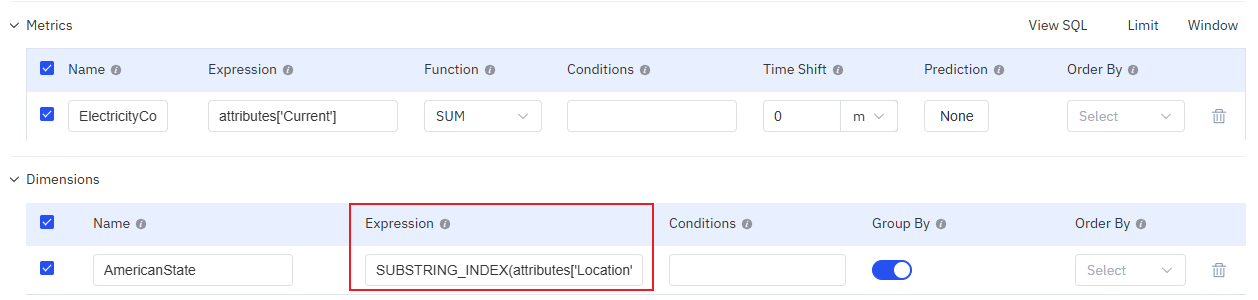
The GeoJSON properties for each feature must include a key that matches the geographic identifier attribute on your elements. This is how the map connects each region polygon to its corresponding data value.
Map Display
The color gradient for the choropleth is configured through the Map Display setting, which defines three anchor points:
| Setting | Description |
|---|---|
| Map GeoJSON | Upload or edit the GeoJSON file defining region boundaries |
| Map Display | Color scale: Min (value and color for the low end), Middle (color at midpoint), Max (value and color for the high end). Click color swatches to change them. |
| Display Labels | Toggle: show region name labels on the map |
Example Scenarios
Energy consumption by province. An energy utility has elements organized by province. A map chart with a province-level GeoJSON file shows total monthly energy consumption per province. Darker blue regions consumed more; lighter regions consumed less. The operations team immediately identifies which provinces are above forecast.
Site performance by country. A multinational company has sites in 20 countries. A country-level GeoJSON with a green-to-red color scale shows OEE (Overall Equipment Effectiveness) per country. The map highlights underperforming regions that need management attention.
City-level sensor coverage. A smart metering company has meters deployed across a city's districts. A district-level GeoJSON shows the number of active meters per district, revealing coverage gaps where fewer meters are reporting data.
