4.2.3 Pie Chart
Overview
The Pie Chart divides a circle into slices proportional to each value's share of the total. Each slice represents one category or metric group, making the relative contribution of each part immediately visible.
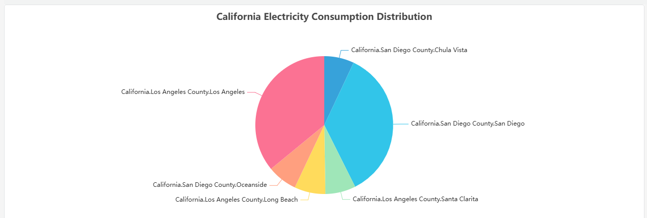
Slice labels are displayed directly on the chart. The chart is most readable with fewer than eight slices — beyond that, small slices become hard to distinguish and a Bar Chart or Table is a better choice.
When to Use
Use the Pie Chart when:
- You want to show how a total is distributed across a small number of categories
- The relative proportion between parts matters more than absolute values
- You have five to seven categories at most
Avoid the Pie Chart when categories are numerous, when values are close in magnitude (differences are hard to judge by arc size), or when tracking change over time. Use the Bar Chart for comparisons and the Trend Chart for time-series data.
Configuration
Edit Mode Toolbar
In addition to the common edit mode controls, the Pie Chart adds:
| Control | Description |
|---|---|
| Save as Image | Download the current preview as a PNG image |
| Full Screen | Expand the editor preview to fill the browser window |
| Panel Insights | Run AI analysis on the current preview data |
Graph Settings
| Setting | Description |
|---|---|
| Title | Chart title displayed above the pie |
| Subtitle | Secondary title shown below the main title |
The Pie Chart has no Axis, Limits, or Legend sections. Slice labels and percentages are rendered directly on the chart.
Example Scenarios
Power consumption by phase. An electrical engineer adds three metrics — Phase A, Phase B, and Phase C current — to a pie chart. The chart immediately shows whether the load is balanced across phases or concentrated on one.
Production share by shift. A plant manager adds a Dimension grouping by shift (Day, Evening, Night) with total units produced as the metric. The pie chart shows each shift's contribution to the daily production total.
Event distribution by severity. An operations team adds a Dimension grouping by alarm severity category. The pie chart shows what fraction of events were critical, warning, or informational — useful for a shift summary report.
