4.2.8 State Timeline
Overview
The State Timeline displays how a value changes over time as a horizontal colored band. Each segment of the band is colored and labeled according to the value it represents, making it easy to see at a glance how long a process was in each state and when transitions occurred.
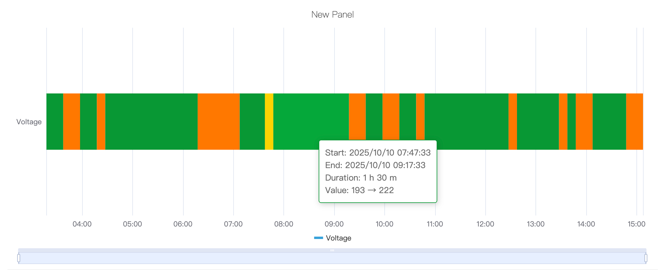
Multiple metrics render as multiple stacked horizontal bands, enabling side-by-side comparison of state histories across different signals.
When to Use
Use the State Timeline when:
- Your data represents discrete states rather than continuous measurements (on/off, running/idle/fault, open/closed)
- You want to see how long a process spent in each state and when transitions happened
- You need to compare state histories across multiple signals or equipment on the same time axis
For continuous numeric signals, use the Trend Chart. For a compact grid view of states bucketed by time interval across many metrics, use the Status History panel.
Configuration
Edit Mode Toolbar
In addition to the common edit mode controls, the State Timeline adds:
| Control | Description |
|---|---|
| Save as Image | Download the current preview as a PNG image |
| Full Screen | Expand the editor preview to fill the browser window |
| Panel Insights | Run AI analysis on the current preview data |
Graph Settings
The appearance of each state band is controlled by the following settings:
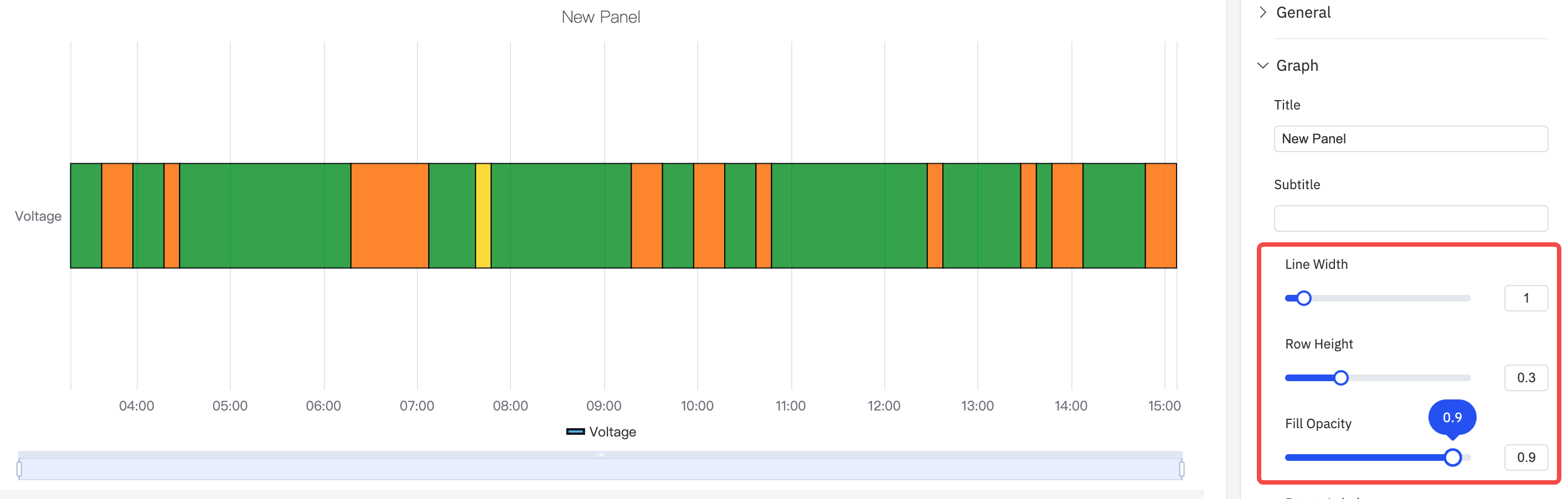
| Setting | Description |
|---|---|
| Title | Chart title |
| Subtitle | Secondary title |
| Border Width | Width of the border drawn around each state segment (0 = no border) |
| Row Height | Relative height of each band (default 0.3) |
| Fill Opacity | Transparency of the state color fill, 0–1 |
| Rotate Labels | Rotation of X-axis time labels |
| Label Interval | Density of X-axis labels |
State colors and labels are determined by the Value Mapping configuration, where you map each value (e.g., 0, 1, "Running") to a display color and text label.
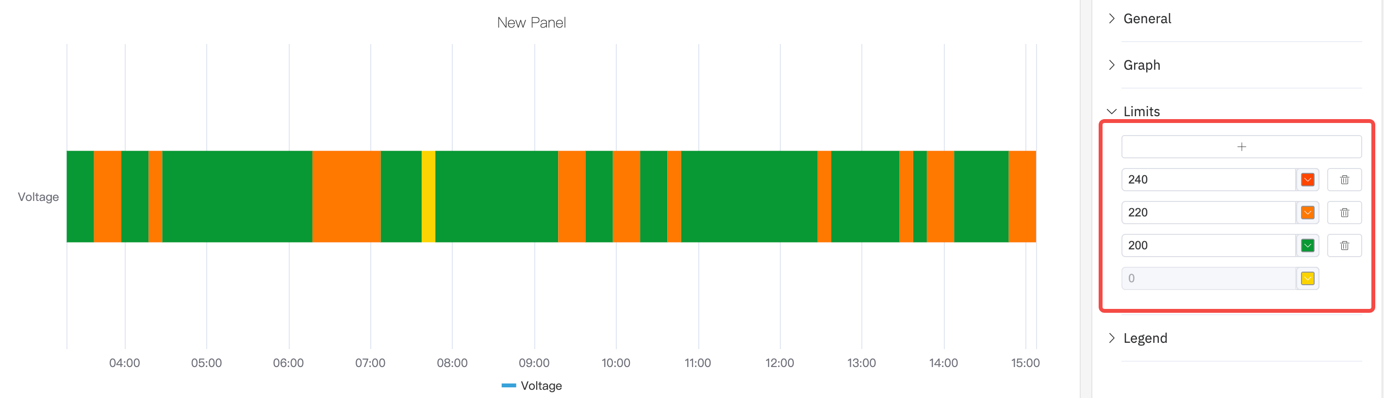
Limits Settings
Limit lines can be overlaid on the timeline to mark threshold values:
Legend Settings
The legend identifies each state color. In Table mode it can also show summary statistics:

| Setting | Description |
|---|---|
| Show | Display mode: List, Table, or Hidden |
| Placement | Position: Bottom or Right |
| Legend Values | Statistics shown in Table mode |
Example Scenarios
Equipment on/off history. A pump's run state (0 = Off, 1 = Running) is mapped to gray and green respectively. The state timeline over a 24-hour period shows exactly when the pump was running and for how long each run lasted.
Multi-mode process timeline. A batch reactor has four operating modes: Heating, Reaction, Cooling, Idle. Each mode is mapped to a distinct color. The timeline shows the full batch cycle from start to finish and makes it immediately visible if any phase ran longer than expected.
Alarm active/inactive history. Multiple alarm signals are stacked as separate bands. A maintenance engineer reviews a week of history to identify which alarms were most frequently active and whether they correlate in time.
